Everywhere you look, things are getting more complicated. Our phones have more than a thousand settings. Showers come with apps. Cars have touch screens. Ovens have touch screens. “There is no doubt that ‘featuritis’ is real,” said design consultant Jakob Nielsen. “Most of these things are very complicated.”
Nielsen says part of the problem is bad design: “In fact, simplicity is difficult to achieve. It takes a lot of time and, I must say, talent as well.”
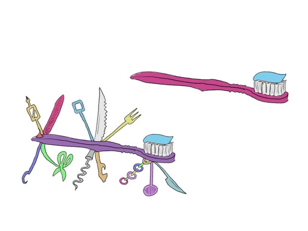
And part of the problem is us. As consumers, we tend to buy devices with the most features. Nielsen said, “If I give you the choice between this toothbrush can do two things and this one can do five things, you might think that the toothbrush with five functions is a better toothbrush.” And manufacturers, who believe consumers will choose the product with the most features, have an incentive to keep adding them.
CBS News
But if you think today’s products are difficult to learn, try designing they.
Jon Friedman, head of design at Microsoft, redesigned all of the icons for all of Microsoft Office’s commands, which number in the tens of thousands. He says that if a new version of Office simplified its commands, eliminating those that aren’t used much, “some people would feel like we removed something that was very important to them. deal with: How do we harness the power of what can be added to products as technology improves and make it really simple for people?”
CBS News
Over the years, Microsoft has often tried to find this balance. When people complained that Microsoft Word was too complex, Microsoft offered a simpler, more streamlined word processor called Write. It was a bombing. “It was one size fits all,” Friedman said. “And that is very difficult. Simplicity can only emerge when it is truly adapted to each individual’s definition of what is simple for them.”
CBS News
Then there was Clippy, the cartoon paperclip. “Clippy would proactively show up in something like Word and say, ‘It looks like you’re trying to write a resume,’ and it would help you do something, like write a resume,” Friedman said. Clippy also failed.
Achieving simplicity is even more difficult when you design cars, because your customers must keep their eyes on the road.
“Everything is getting more complex,” said Frank Weber, head of vehicle development at BMW, another company that has experimented with designs aimed at simplicity. “You can imagine what that means in a vehicular environment, where you have to drive in addition to getting all kinds of information.”
In the early 2000s, BMW introduced a roll/tilt/click button for navigating menus, called iDrive. It was no a hit. “We were heavily criticized,” Weber said, “because their experience was different [than what] they had with their other vehicles. You have to be very careful not to overwhelm people when you pass from one generation to another.”
But now, are you ready for some good News? These companies say that, thanks to innovative new technologies, they are on the verge of curing featurite once and for all.
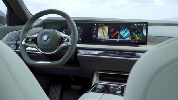
In BMW’s 2025 cars, it will be via voice control, where drivers can use voice commands instead of navigating a menu on the dashboard. “Whether you order a service, whether you want to change the interior color of your vehicle, whether you want to switch to a sport mode, typical things where you have to delve into the menu structure, people will never do that again,” Weber said. .
New cars can also display important information under the entire windshield, so you don’t have to look down.
And unlike some automakers, BMW promises not to eliminate physical radio and climate buttons.
BMW
The car’s controls will, in fact, be divided – some tasks requiring voice, some touchscreens, some buttons and physical buttons, depending on which control is best suited. Weber said, “I think optimizing this configuration is the art of controlling a vehicle.”
Meanwhile, Microsoft says it is also on the verge of solving the complexity puzzle, according to chief marketing officer Yusuf Mehdi. “We are at the beginning of the next wave of computing,” he said, “probably the most impactful thing you and I will see in our lifetimes.”
The solution, Mehdi said, is artificial intelligence. “A lot of the complexity of files and menus and buttons will all disappear because AI will allow us to order only what we want,” he said.
This feature, called Copilot, is a new application for smartphones and computers. Want to put your PC in dark mode? Just ask. Do you want to receive emails for your mother? Just ask.
Of course, not everyone will be happy. “People don’t like change, that’s for sure!” laughed Mehdi.
So will voice control and AI help with the complexity problem? We’ll soon find out. In the meantime, if you feel intimidated by the complexity, design consultant Jakob Nielsen has two parting pieces of advice. First, there’s no need to feel like a technological loser: “It’s not your fault; It’s the designer’s fault for complicating things, because it doesn’t need to be complicated,” he said.
And second: buy simplicity. “Don’t be seduced by this promise of a toothbrush that can do 20 things, when you only need it to do one thing. Opt for simplicity,” said Nielsen. “And then, your life will be happy.”
For more information:
Story produced by Jon Carras. Publisher: Remington Korper.


